Headway


Overview
About Headway
Ideally everyone would know or be taught about their options and resources for their finances however that's just not reality. Headway provides a safe space for everyone to take control of their finances while learning how to manage their finances for the future.
Debt comes in many forms but it usually starts with one credit card at a time. Using head way provides access to the newest financial news, debt tracking and the ability to connect with others to have a open conversation about finances.
My Role
Product designer
Project Duration
8 Week Project
Tools
Figma
Miro
Invision
Challenge
Many Americans don’t know where to begin when it comes to managing their finances. Without accessible guidance or a trusted support system, financial planning can often feel overwhelming and isolating.
Headway was created to serve as the first step toward financial confidence; providing users with a safe, approachable space to discuss money, explore financial opportunities, and build healthier financial habits.
Solution
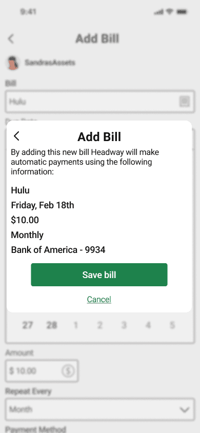
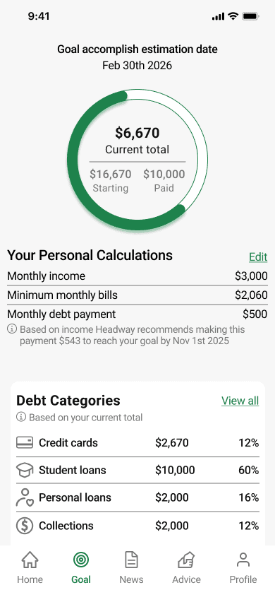
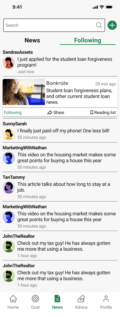
To help users better manage their finances, I designed an auto pay feature that keeps recurring payments organized in one place. I also introduced a personalized financial news and social feed that provides educational content while encouraging open discussions with peers. Additionally, I created a goal setting experience that allows users to track progress toward reducing debt and building healthier financial habits.
Research
Secondary Research
Through my secondary research I wanted to know what was at the root cause of financial stress. In two different surveys, Americans ranked debt and savings the highest for what they are most worried about. Finding a starting place to get out of debt was also the hardest part.
Primary Research
To better understand how users currently manage bills and navigate financial planning, I conducted screener surveys to recruit participants across varying levels of financial experience including users with established financial plans, users seeking guidance, and users who experience financial stress.
Following participant interviews and data collection, I synthesized findings into affinity groups, empathy maps, and personas to identify key pain points, behaviors, and user needs

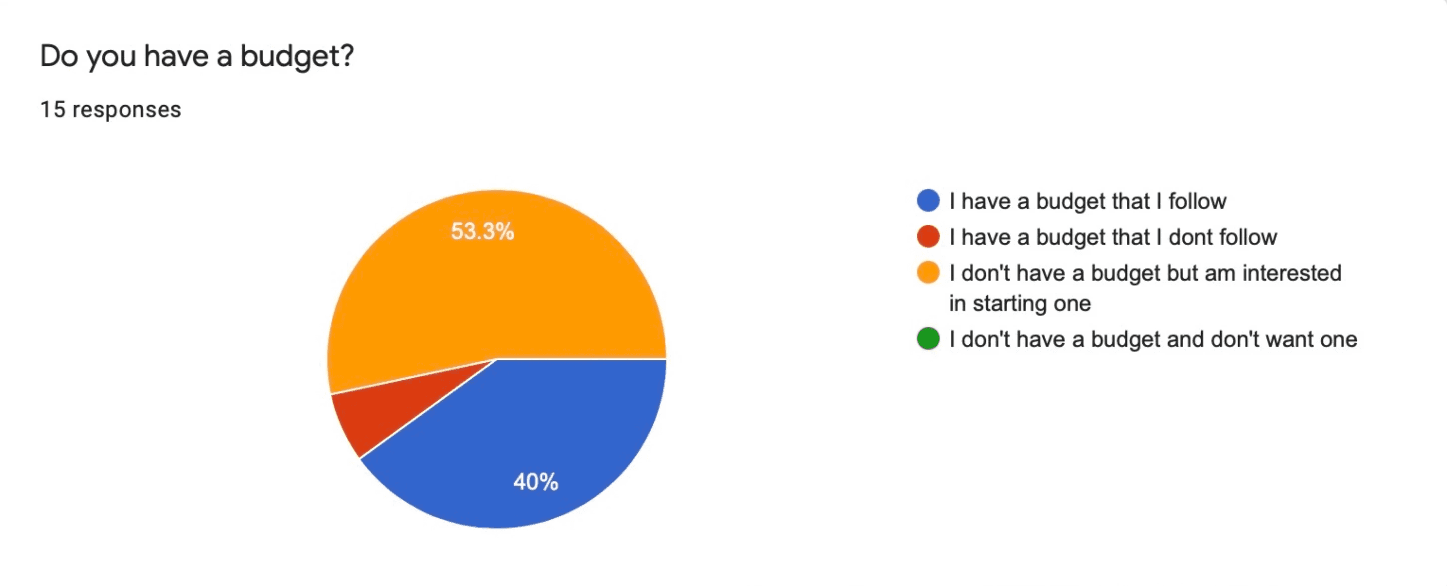
1
Survey
5
Questions
15
Responses
5
Remote Interviews


Interviews
I conducted 5 user interviews in order to get a better understanding around:
Current bill tracking system.
Their current debt tracking system.
Confidence level in their financial knowledge.
Their experience talking to others about their finances.

Affinity Mapping
With my interviews I was able to narrow it down to four main needs:
Financial support
Responsibilities/ expenses
Organization/ planning
Financial goals

Empathy Mapping
Affinity maps were then categorized into two empathy maps, keeping track of finances and those who are not.


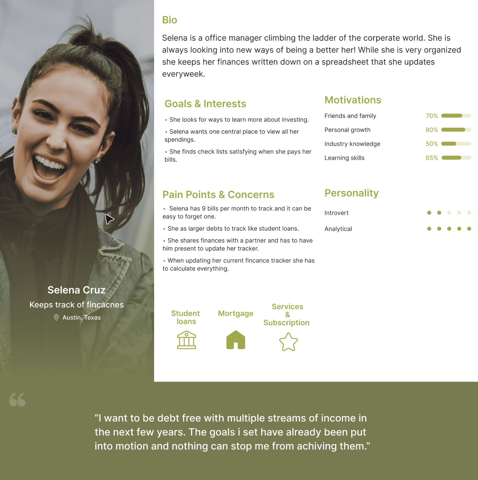
Personas
Keeps track of finances
A Full time working woman with big ambitions! She's the perfectionist that is self motivated to be the best version of her she can be. She likes to have everything laid out in front of her to make sure nothing is missed.
Does not keep track of finances

With a busy schedule he doesn't always have time to search the web for the newest financial opportunity but he has the basic knowledge of what he wants to look into. He does have people he can speak to openly about his money but its not usually what hes looking for.
User Stories
Before I could get started with designing I like to identify the most important functions this app needs. User stories were categorized by priority, the highest being the most crucial functions, this helped me understand the necessary features and elements that need to be implemented for a smooth experience.
As a user
As a full time student, I want to know the latest news when it comes to loans and grants so that I can make sure I'm not missing out on any opportunities.
As a user who just moved out, I want to track all my bills so that I can make sure nothing goes missed.
As a mom with kids about to graduate, I want to know how much debt I already have so that I can calculate how much I'm able to help my kids with.
As a mom, I want to have my bills auto update so that I don't forget anything.

HMW's
The final piece of my research was to synthesize this data, with How Might We (HMW) statements to clearly communicate the most important problems users want solved.

How might we relieve the feeling the user is alone in their financial struggles?
How might we help users feel confident in products they buy?
How might we guide users through controlling their debt?
How might we relieve the sense of overwhelm when tracking the amount of due bills?
How might we provide a starting point to organize finances?
Ideate
Site Map
Now that I had a better idea of what my users needed I created the sitemap with the intent of simplicity.
I need a place that not only helps organize and educate but also gives the ability to open up a conversation with others about finances.

User Journey
User flows helped define the structure and navigation of each screen, ensuring users could complete key tasks with clarity and ease. From the MVP, I focused on three primary flows that were central to the Headway experience:
Posting within the community financial feed
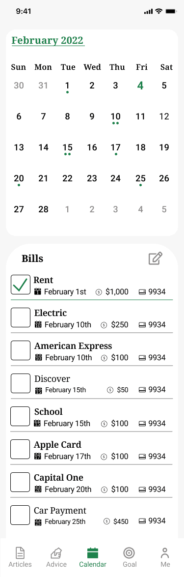
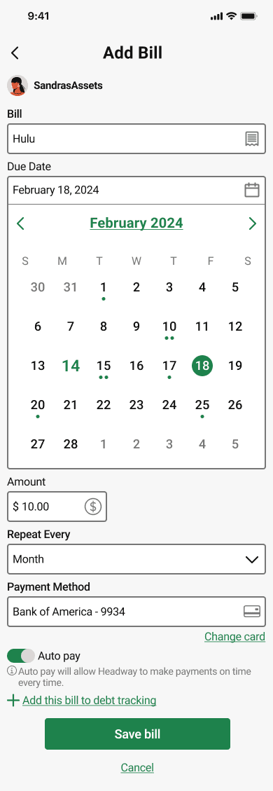
Adding a recurring bill
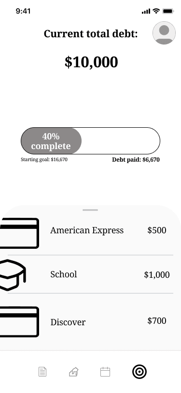
Track individual debt progress
Add a bill to my calendar

Check debt progress

Post about a financial goal

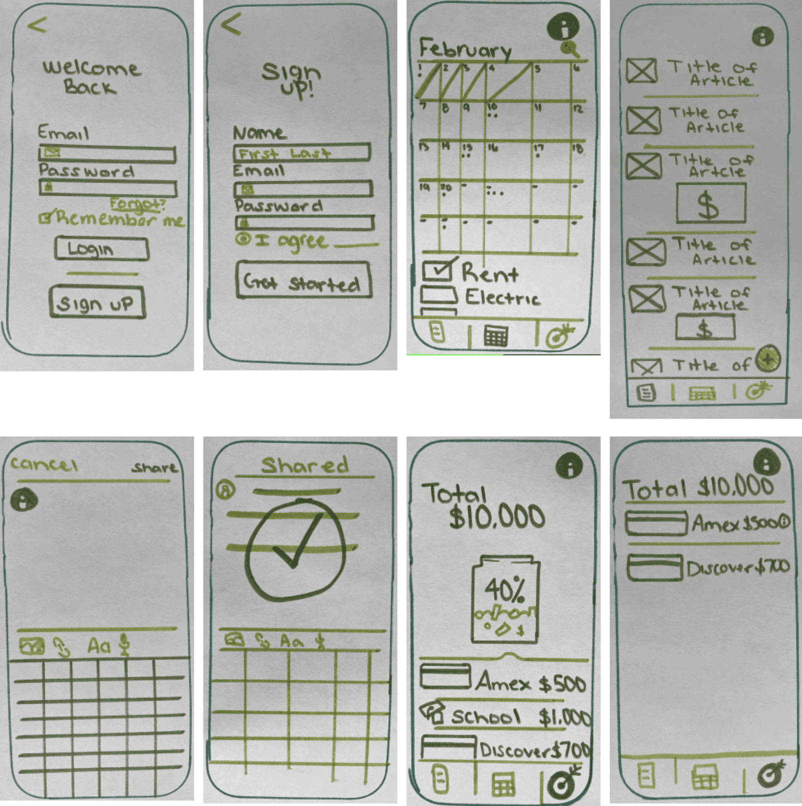
Sketches
Sketching helped me bring those user flows to life, putting as much information as needed on one screen without it being overwhelming was the biggest task but after a few screens I was heading in the right direction.
Design
Low Fidelity Wireframes
I translated my initial sketches into low fidelity wireframes in Figma, which helped define content hierarchy, improve screen spacing, and clarify how key visuals would be introduced throughout the experience.


Testing
Remote User Testing

Most participants had previously completed the initial screener survey and were later contacted to participate in usability testing, while additional participants were selected at random.
Participants were asked to complete three primary tasks:
Track progress for an individual debt source
Publish a post within the Headway community feed
Add a new bill
Overall, users found Headway intuitive and easy to navigate. However, several recurring usability issues emerged throughout testing.
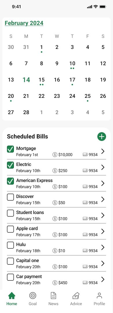
The most common concern was the absence of a clear “Home” navigation option. Participants also found the “Calendar” label misleading, as the screen contained both calendar and bill management functionality, making its purpose unclear.
Another recurring issue involved the posting experience. Users expected either a confirmation step or a draft saving option before publishing a post to the social feed.
Lastly, when asked to add a new bill, several participants initially navigated to the Goals screen and attempted to edit debt sources instead of accessing the bill management area, revealing confusion between financial goals and bill tracking.
These insights helped guide the redesign process, allowing me to identify clearer navigation patterns, improve feature labeling, and refine key user flows throughout the app.
Test Report
Overall, users found Headway fairly easy to use and understand. The testing did allow me to identify minor problems to address while providing insight on what would be beneficial for the user.

Redesign
Before Testing
1
Update Home from “Calendar” to Home
Updated calendar Icon from calendar to Home
3
Update language from Bills to Scheduled Bills
Updates not found in testing
Typography font, size and weight adjusted
Navigation bar updated
----------------
Add bill icon updated
Check box feature UI updated only
Icon removed from bill due date
Arrow button added to inform the user that more information is available
After Testing

After Testing
2
Save to draft button added to the button of the Create Post inputs
Updates not found in testing
Typography font, size and weight adjusted
Primary buttons visual updated
----------------
Header added for consistency
Line break under header removed to increase white space
Input box’s updated for better scalability


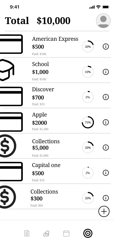
Highfidelity Wireframes


The core objective of the design process was to create a streamlined and approachable experience that supports users on their journey toward financial confidence. Through ongoing iteration, I refined layouts, optimized the use of space, and reworked key features to improve clarity, usability, and overall user experience.
Style Guide


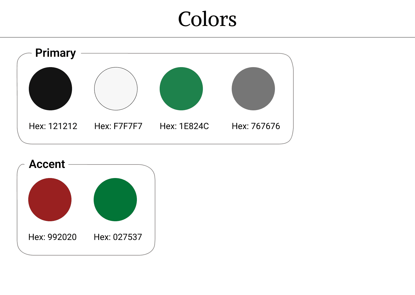
With the app’s structure finalized, I developed a clean and approachable visual system centered around a light mode experience. Rich accent colors and a green primary palette were intentionally chosen to evoke trust, financial growth, and user confidence while navigating the product.

